Top Moving Company Website Designs
While it’s no secret that website design is a worthwhile investment for any moving company, it’s still something that makes us feel all fuzzy inside when we see it done well. We like to think of great website design not as the key to success, but as a symptom of it. Great website design is the next logical step for a growing moving company as more customers begin to engage online.
We’re here to show a little praise for what we feel are some of the top moving company website designs. To compile this list, we searched for a wide range of features that moving companies employ for a seamless user experience. We chose features like smart navigation, engaging content, innovative tools, and unified designs. These elements are an extension of the high level of service these moving companies provide.
So, without further ado, here are our top moving company website designs!
Seamless Navigation
Let’s start with a feature that every website has, but can have many unique variations, the humble menu. There’s a menu for every type of navigation imaginable, but using the right menu for the right purpose can be tricky. These two moving companies use great menu design to make the most of their website’s space.
Retractable menu
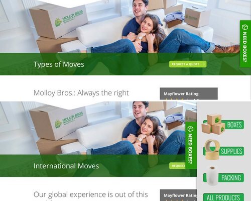
The first menu style we’re highlighting features a retractable menu, integrated into each page of the website. When you click the tab on the righthand side, the menu expands horizontally. When clicked again, it retracts to its original size. At first, the user may not notice this menu because it’s not obtrusive — this is key to the success of its design. If a user needs the menu, however, it’s right there waiting.
Molloy Bros. Moving & Storage
Space-saving tiles
This next menu style is the epitome of a space saver. It features a series of tiles designed to display information horizontally, opposed to vertically, which would require scrolling or page jumping — which is basically when a web page scrolls for you. The buttons stay within reach when clicked, which makes toggling between them easy. This saves the user time and can help improve exit rate.
Metcalf Moving & Storage
Practical Maps
For multi-facility moving companies, a dedicated map is a must. A map is a great visual medium for showing potential customers all of the areas a moving company services. For functionality, this means directing customers to the correct web page easily and showing preliminary pricing information. A great map is all about user engagement that serves a purpose. Metcalf has locations in the Saint Paul and Rochester areas of Minnesota.
College Hunks Hauling Junk & Moving
Bonus! Storage Company Map
Manhattan Mini Storage
Shrewd Forms
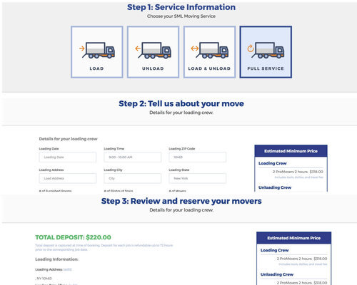
The next moving company website design we chose is something infused in our Updater DNA, the intelligent form. As you already know, forms are an integral piece of many moving company websites because they’re a primary driver of leads. In many ways, they service the main purpose of the website. The smarter the lead gen form, the more leads — that’s logic. It’s also why we love this clear, multi-step form.
Simple Moving Labor
Innovative Visitor Features
It’s important to step back once in a while and ask why users are engaging with your website. Some visits are going to be informational. These visitors are going to be in more of a discovery phase — collecting information and exploring their options. Other visitors have already completed their research and are looking to make their decision. They’re considered to be further down the funnel and ready to take the plunge.
When comparing moving companies, users often make their decisions based on what amenities are offered. These next four features are just a couple of ways these potential customers can be courted.
Live chat, for real
As we’ve all experienced, it’s frustrating to have a question about a website or service and have no one to ask. A lot of websites are employing a chatbot to answer users’ questions 24/7. This is helpful for directing users to the correct page and helping turn traffic into leads. The only thing better than a chatbot? A live person answering questions, of course! Before you plan on staffing your office all night, you should check out platforms such as Zendesk, a customer service platform that assists companies in providing support to their customers.
AAA Movers
Video survey
Up next is the video survey. An innovative feature that we believe adds tremendous value to a moving company’s website. Video survey is made for the smartphone age and features live video-chatting with a representative to ensure the most accurate estimate possible.
Users are often asked to provide a detailed account of all their belongings in order to get a precise estimate. Now, users can schedule a time to chat in advance, show exactly what they need moved, and get excited about their moving date, instead of dreading it. This is a perfect way to use technology to solve an old problem in a new way while driving user engagement.
Ridgewood Moving Services
Video blog
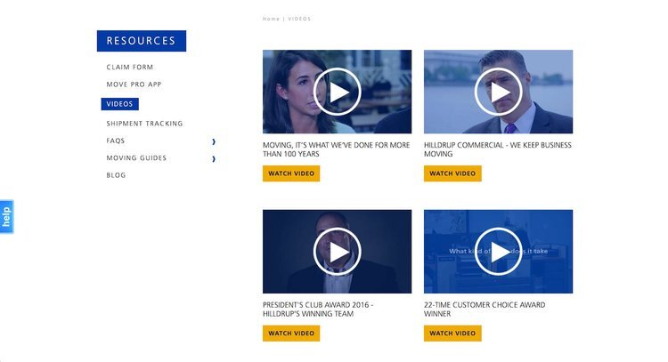
At Updater, we know how rewarding it is to run a blog, but also how challenging it is at times. So, when we see a moving company with a comprehensive and well-organized set of video content, we get excited. Providing videos for potential customers is a great way to engage them when they’re looking to choose a moving company. It’s also great for current customers because they can watch these guides while they’re physically packing. Moving companies are moving experts and videos are a great way to demonstrate their expertise to customers.
Hilldrup
Social media presence
Social media works for a moving company website in two ways. First, it brings visitors to the main website from a platform like Facebook, helping to generate leads. Social media tabs on the website can then guide customers back to the social media page, driving interaction with the brand and keeping engagement steady.
Whether this means posting photos or sharing content, it all helps drive referrals and is worth the upkeep. Getting customers to engage with your social media requires regular updates and a bit of creativity. That’s why we couldn’t resist these social media icons below — so cute! They’re a creative way to drive traffic to social channels and get bonus points for style.
Lexel Moving & Storage
lexel-top-moving-company-website-design
Showcasing Partnerships
We know how much time and effort goes into building and maintaining partnerships and affiliations, so we think that hard work should be recognized. Having a section of your page showcasing partnerships affirms your moving company’s place in the industry. We think it’s important to give shoutouts to your friends. We also think it’s great when a moving company has a charitable partner. Lexel is a Boston-based moving company with locations in Boston, Waltham, and New York.
Bekins Northwest
Mobile Responsiveness
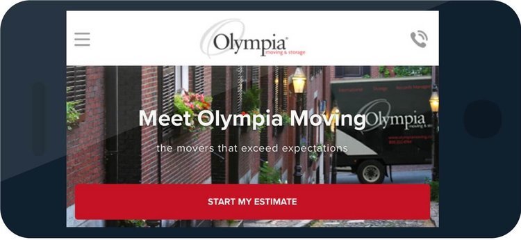
Customers are going to view your website on their phones. We just had to state the obvious. Now that we’ve covered that, we can get into what constitutes a great website for mobile. You don’t have to go so far as to have a dedicated app or build a completely separate site just for mobile, but your website should be mobile-friendly.
The health of a mobile website runs the gamut from its load time, to how readable your text is on the small screen, to the way menus and tools are reformatted so they still work intuitively. Moving companies can give prospective customers the same great experience they’ve worked so hard to provide on their desktop website, on their mobile site. It just takes a little extra time and a bit of care.
Olympia Moving & Storage
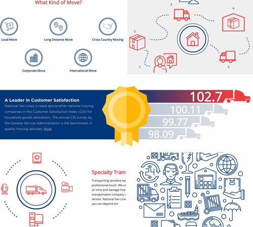
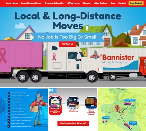
Unified Design
The last great moving company website design is one of those ‘you know it when you see it’ kind of deals. We think of it as making a website that both looks and works on a singular theme. You may not notice it at first, but color choice, image and button design, and even text all work together cohesively. We think this makes for a great user experience, unifies branding, and ensures every element of a moving company website is relevant.
Let’s show you what we mean:
National Van Lines
national-van-lines-collage-top-moving-company-website-design
It’s easy to have a preconceived notion of what a website should look like. Traditional themes and images are effective, but a website is the perfect opportunity for strategic design. When your theme is consistent you can do almost anything and it will look amazing — and more importantly function well.
Bannister Moving & Storage
A Quick Recap of What We’ve Learned
There’s no ‘one feature’ that’s required on every moving company website. Moving companies are unique in their service, their customers, and their personalities. So, we treat these moving company website designs as lanes on a highway. You don’t need every lane to reach your goal of being an amazing moving company, but each avenue sure helps! Feel free to pick and choose which website design works best for your needs. You want to be proud of the design you choose and confident that it will help you drive leads and provide the best service possible.

